What looks cool like Frostbite but is better than Frostbiiiite? Frostmurrrrriiiite!

I really love what you've created here. It has the nice atmosphere of Frostbite without the frustration of the choke node and exhausting gameplay.
The map is very atmospheric with the thunder and lightning effects, especially with the moody dark smoke/clouds. I think adding some falling snow would complete the feeling of being inside or close to an approaching snowstorm. I would also consider making the tunnels a bit less bright.
The layout of this map is relatively complex, with two "floors" or levels in the center of the map. I think this gives both pedestrians (in the underground level) and vehicles in the upper level plenty of room to duel without making the center area feel crowded.
At the same time, it may be a bit difficult for our players to learn the layout of this map, in particular because of the team-controlled gates. I'm also a bit concerned that players will abandon a lot of vehicles when they want to reach the underground area (if the gates are closed by the other team). The upper level, where most of the vehicle action will take place, is also very hilly and I would suggest to flatten it a bit. It is also difficult to get from the core or primaries to 7 and 8 in a ground-bound vehicle. I think it will be a good idea to decrease the respawn time of vehicles. Is there any way to adjust the time when a vehicle disappears after it has been abandoned (only for this map)?
There are also teleporters from the center node (9) to the two other nodes on the underground level (5 and 6). I would remove those teleporters because I think the team that wins the center node could overrun the other two nodes too easily. Nodes 5 and 6 are on the same level, so reaching them should not be too difficult (I hope). I would also remove the PPC tank there, because I think it will dominate the area too much.
Here are some more random thoughts:
I love that there are many vehicles available at the bases. There shouldn't be any transportation problems.
Some of the snowy rocks at the primaries don't make sense. That is because they are covered in snow on all sides.
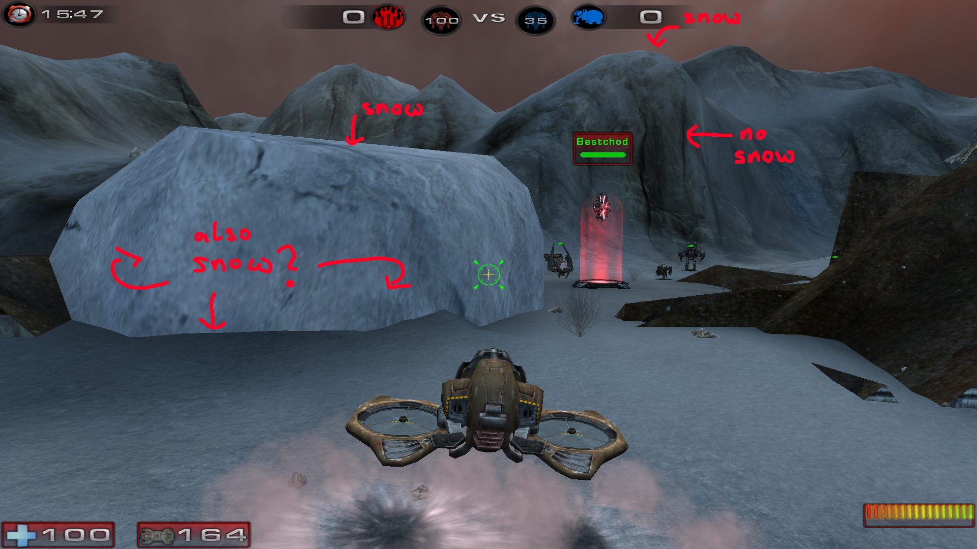
- Weird snowy rocks.jpg (1.26 MiB) Viewed 11849 times
The ruin at the right primary looks a bit out of place. If you compare it to the other architecture, the bricks are much larger and the wall is simply too thick (the walls in the castles are all relatively thin). Maybe there is a broken pillar or some loose bricks that could go here?
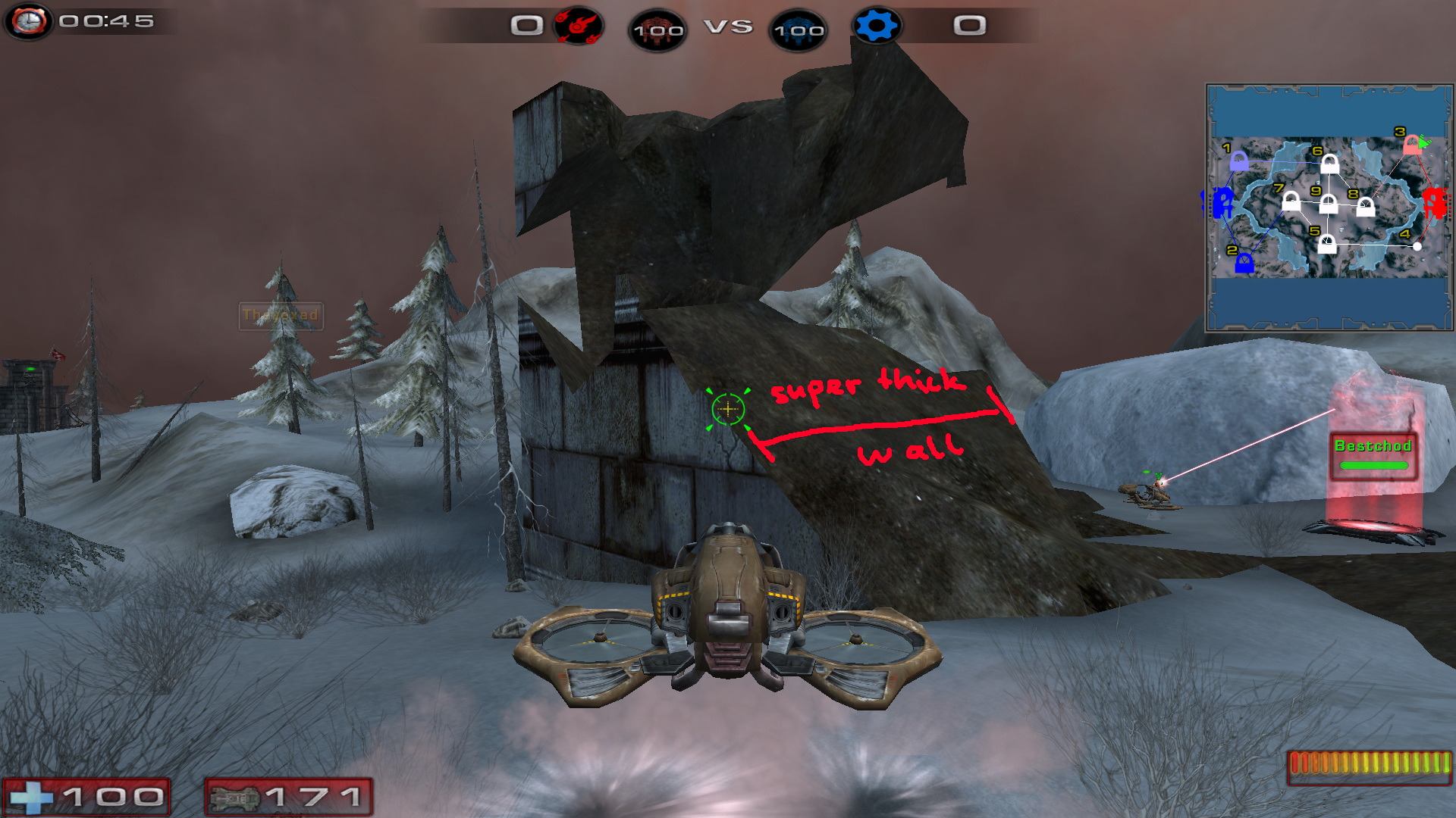
- Ugly ruin.jpg (1.42 MiB) Viewed 11849 times
It may be difficult to find nodes 7 and 8. I think if you add stairs from the ice paths, it would give a visual clue where players have to go. It would be enough to have a few steps or broken stairs. The alternative would be to flatten the terrain there, to help ground-bound vehicles reach those two nodes.
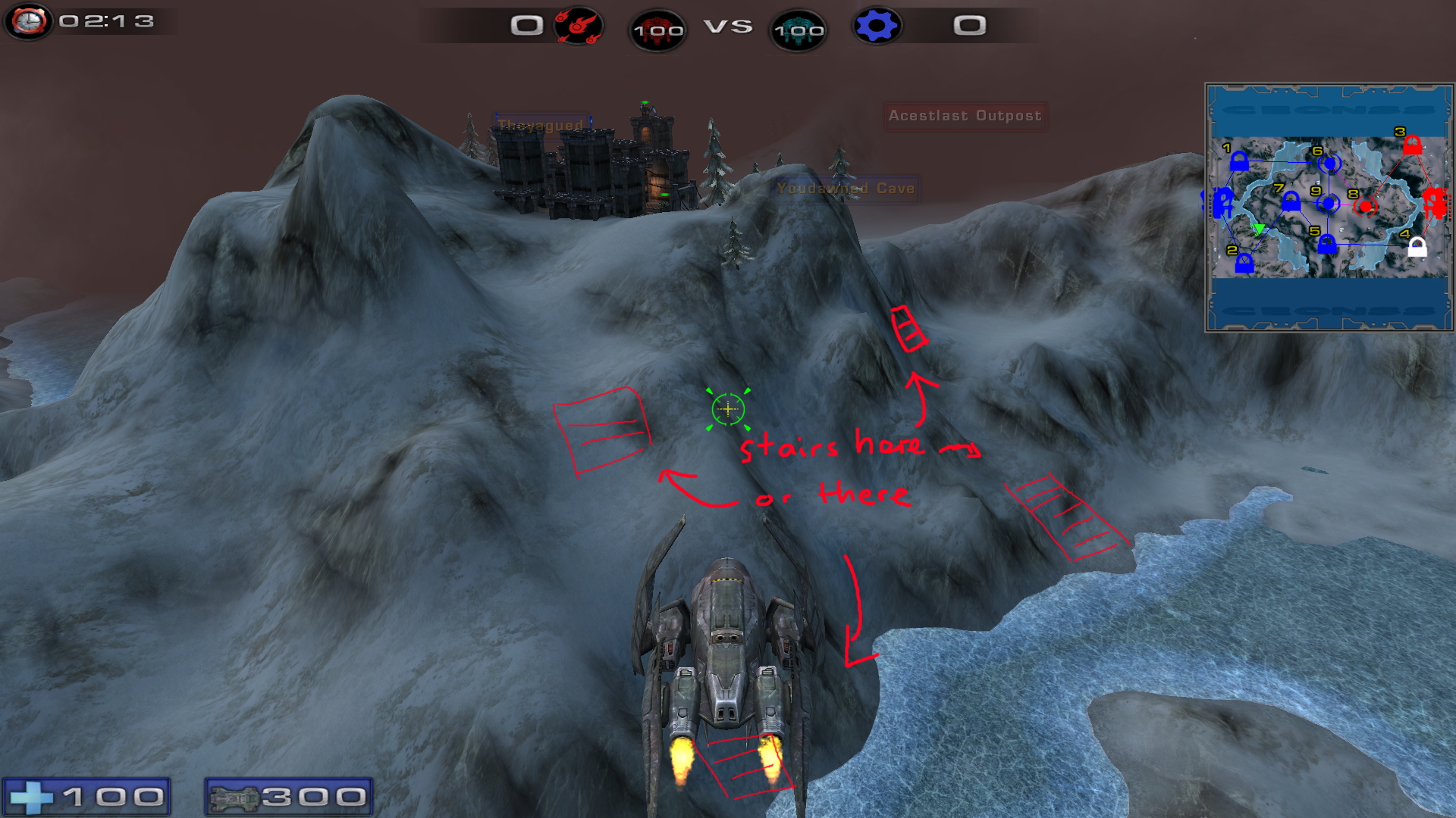
- Stairs.jpg (1.39 MiB) Viewed 11849 times
I really like the cave nodes. I think the design looks really cool! But Dally is confused by the castles/towers around the nodes. I would suggest to make the tower next to the node shorter (or move it) so that players can see the light from the node when they enter the cave. They should not be able to shoot it from the entrance, but they should be able to see the beam of light from the node.
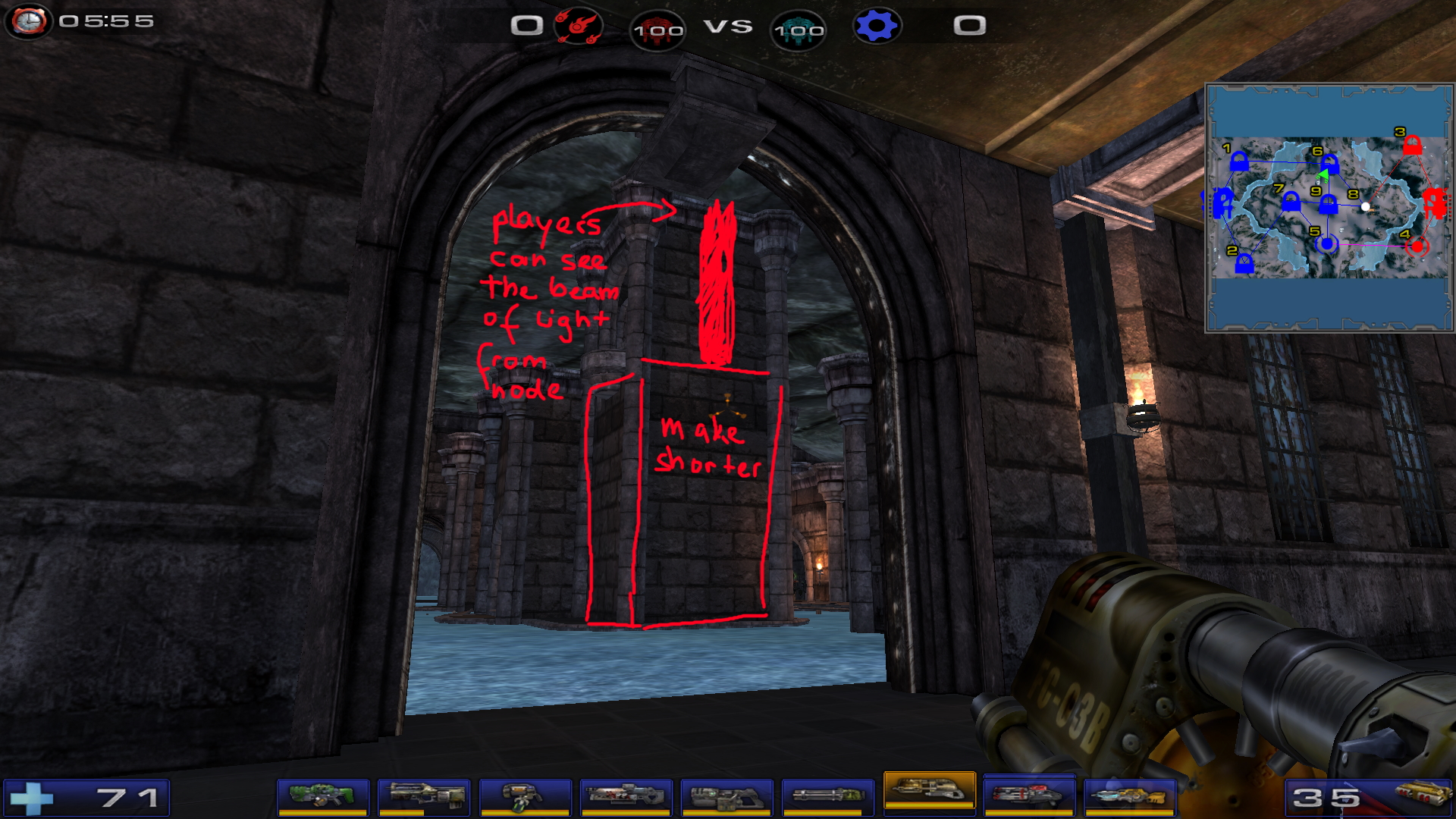
- Cave nodes.jpg (1.47 MiB) Viewed 11849 times
I'm confused by the design of the paths at nodes 5 and 6. There are stairs in the middle (in the green circle) that go down. Then there are stairs at the sides that go up and down again... and behind the wall with the green circle, there is an elevator to the top.
I think it would be easier to push the main tunnel (with the green circle) back. That will allow for more space at the node. On top of the tower (with the green circle), you could have the elevator to the top. That way, if the players are going up, they know that they will reach the surface.
And instead of the stairs at the sides that go up and down again, an archway is enough. I hope I could explain this...
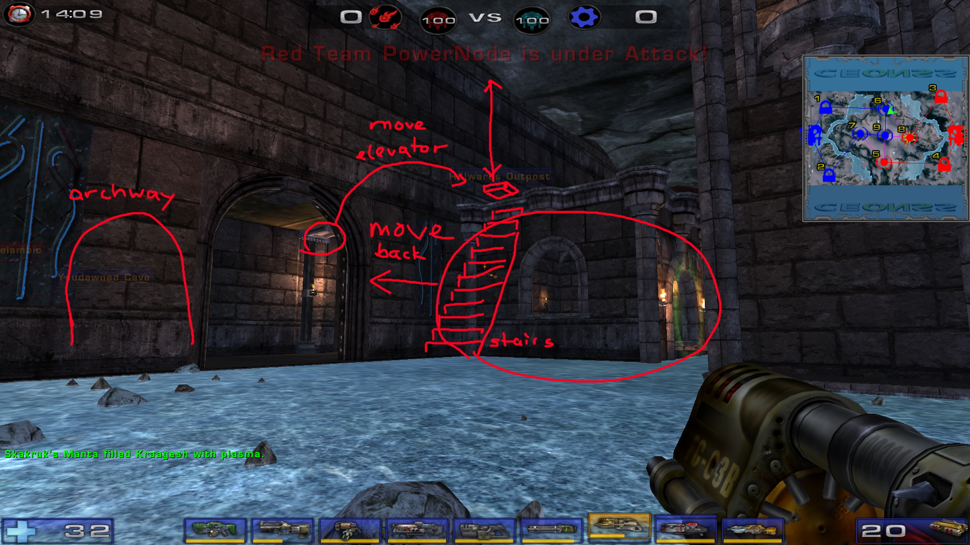
- Elevator.jpg (1.72 MiB) Viewed 11849 times
I love the addition of the CEONSS logo to the minimap! Thank you for that!

I think a dark grey background (like this forum's color maybe?) would have a better contrast with the logo, though.
I hope I could provide some ideas. Really great work, I'm looking forward to this map a lot!
